Higi is a healthcare kiosk installed in pharmacies and grocery stores across the U.S., offering biometric tests such as blood pressure, weight, and body composition to tens of millions of users. I led a redesign of the kiosk's "Health Center" experience, where users could connect with Social Determinants of Health (SDOH) programs. Despite high kiosk usage, very few users were engaging with these programs. The goal was to improve understanding, visibility, and conversion for these resources.
Our team set out to improve how health programs were introduced, explained, and positioned within the kiosk experience. We focused on creating clearer value propositions, simplifying navigation, and embedding health resource prompts directly into the user's existing journey.
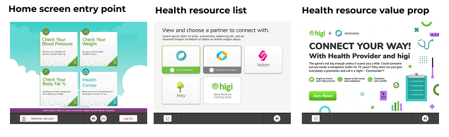
The original "Health Center" entry point was vague and underperforming. It included a generic label and a thumbnail logo that led to a marketing heavy screen with little clarity or perceived value. As a result, users didn't engage or convert.
We hypothesized that users didn't understand what the health programs were or how they could benefit from them. The entry points were disconnected from the user's intent and flow. We needed to make the resources more visible, relevant, and actionable within the moments users were most primed to take the next step in their health journey.

I served as the lead UX designer on this project, driving it from discovery through implementation. I led user research, designed and prototyped new flows, collaborated with engineering and product teams, and aligned with business and legal stakeholders.
In addition to leading design, I managed the end to end research process: recruiting participants, preparing incentives, writing test scripts, conducting analysis, and sharing results across teams. I also facilitated workshops to align teams around user needs and success metrics.
Our hypothesis was that users weren't connecting with the health programs because the entry points weren't integrated into their natural workflow. We believed that by making the programs easier to understand and more contextually relevant, users would be more likely to engage.
We audited the current experience, analyzed engagement data, and reviewed past user testing findings. We found a key opportunity, users were already seeking ways to improve their health based on their biometric results, but the kiosk wasn't delivering next steps. This insight formed the basis of our new strategy.
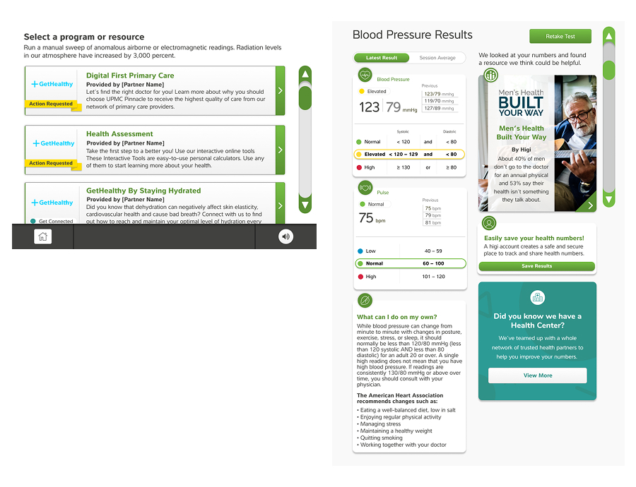
We redesigned the "Health Center" list to display the program name and a concise, plain language description of each offering. We tested a new scrollbar design to make exploration of multiple programs easier, especially for older users.
Next, we embedded health program prompts directly into the biometric results pages. Instead of a generic "Learn More" button, users now saw relevant health resources aligned with their results (e.g., a diabetes support program following a high blood sugar reading). This reframing positioned the resources as personalized next steps, not just optional content.
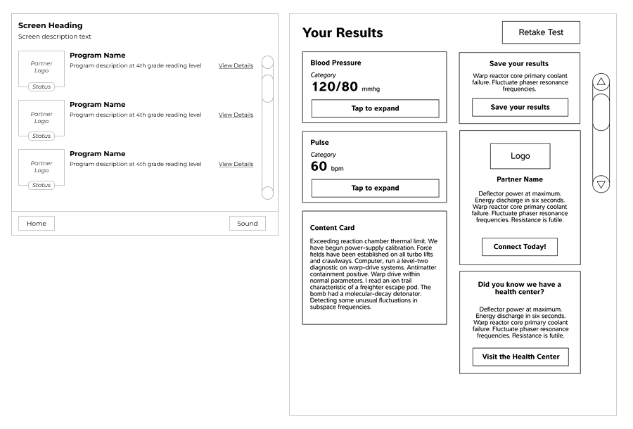
We conducted several rounds of remote, unmoderated testing with 10 to 15 users per session. Using interactive prototypes, we asked users what they noticed on screen, what actions they'd take, and which content they found meaningful.
The feedback was encouraging: users clearly identified the health programs as useful next steps in their wellness journey. They reported better understanding of what each program offered and showed increased intent to explore them. Our scrollbar redesign also tested positively, making it easier to browse multiple offerings.
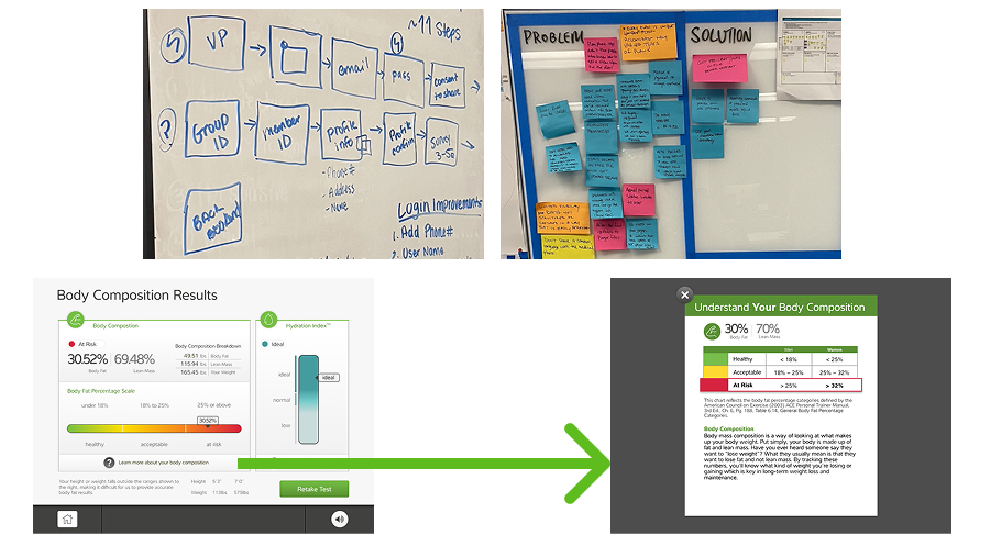
Our redesigned experience dramatically improved engagement with SDOH health programs. By clarifying program descriptions and integrating them into the user's existing workflow, we raised the conversion rate from an estimated 5% to an impressive 45%.
This project demonstrated the value of tying behaviorally relevant UX design to health outcomes. Users not only understood the programs better—they actively chose them as part of their next step toward better health.