Suspected Conditions Interface Redesign
Helping patients be healthier by helping care teams identify and document conditions during annual visits
Project Overview
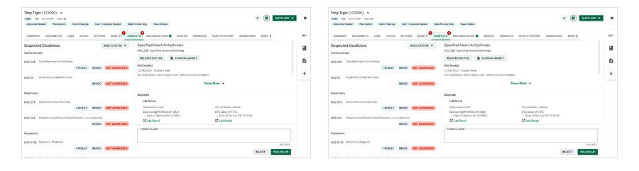
The business wanted to improve how care teams documented "suspected conditions" during annual wellness visits. These visits were critical: they drove better care for patients while also impacting the organization's revenue.
The existing conditions interface was cumbersome and inefficient. Care teams had limited time with each patient, just one hour to review medical history, capture new information, and provide next steps. The business goal was clear: increase the average number of suspected conditions documented per visit (baseline numbers are available, but can not be shared online). My role was to lead design strategy, research, and prototyping to help make this possible.
The Challenge
The initial request was vague: "We need a new conditions interface. Make it better."" But what did "better" really mean? For the business, it meant increasing the number of conditions captured. For care teams, it meant streamlining their already overloaded workflows so they could focus on patient care rather than wrestling with the system. For patients it meant addressing potential conditions earlier so they could be the healthiest version of themselves.
We needed to deeply understand both sides: what the business needed, what care teams actually did in the room, and where the pain points really were.
Context & Constraints
This project was shaped by several unique constraints. Care teams were under intense time pressure with one hour caps per visit, limiting the depth of condition review. Regulations around how conditions were displayed and documented changed mid-project, requiring us to adjust design solutions to remain compliant.
Our user base consisted of scribes and providers with different workflows, so designs needed to support collaboration.
Discovery & Hypothesis
We started by learning before designing. We conducted a literature review of workflows, held stakeholder interviews to align on goals, and gathered baseline metrics.
We began by interviewing around 20 medical scribes and providers to get to know the porblem space, but ended up interviewing well over 100 care team members throughout the design process. We saw where time was wasted, where data was hard to find, and where providers relied on workarounds so ingrained they didn't even mention them until we observed them in person.
Our hypothesis: if we could streamline the suspected conditions interface, make it easier for care teams to consume timely data and better integrate it into existing workflows, care teams could document more conditions without adding time or cognitive burden.
Research
We conducted extensive qualitative research:
- Interviewed well over 100 scribes and providers at different stages of the design process
- Observational studies in clinics to capture tacit workarounds not mentioned in interviews
- Journey mapping to identify pain points and envision future workflows
- Card sorting to validate which supporting data was most useful in documenting conditions
- Multiple rounds of prototype testing throughout the design process to valiade assumptions
The findings confirmed time as the critical constraint and revealed hidden reliance on external resources and clinic-level workarounds. Leadership initially dismissed these as inefficiencies, but our research surfaced their necessity and value to the workflow.
Design Strategy
Our strategy was twofold: design near-term improvements to streamline workflows and shape a longer-term vision for more integrated, supportive tools.
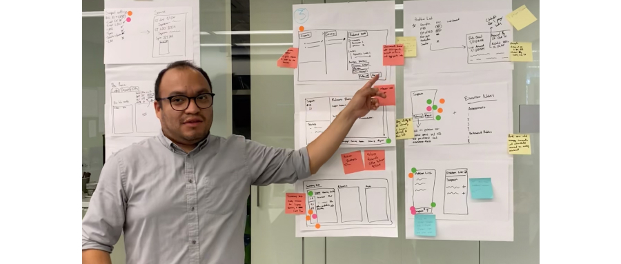
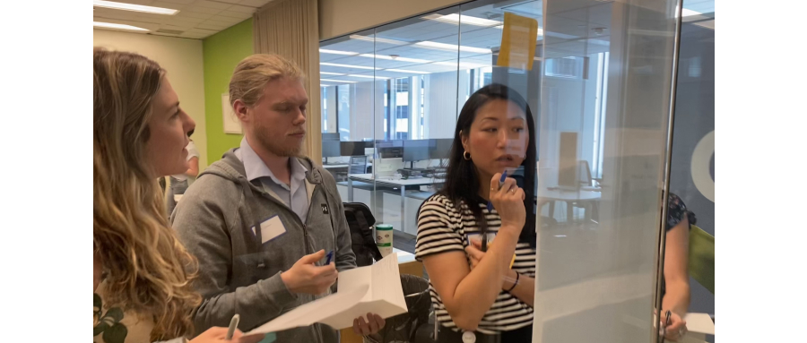
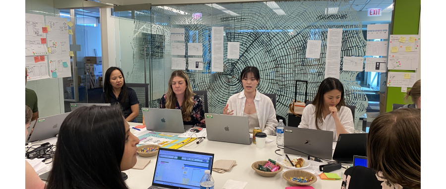
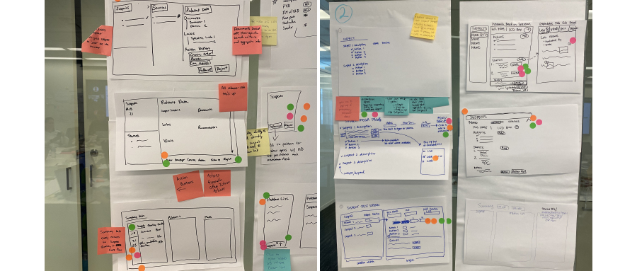
We held an in-person design sprint with VPs of Product, Population Health, engineering architects, medical directors, and frontline care teams. This facilitated empathy-building between executives and users, shifting leadership's perspective from purely business goals to user-centered solutions. Out of this sprint, we identified six key projects (three near-term, three long-term).
User Testing & Insights
We tested early-stage prototypes with care teams, iterating based on feedback from co-design sessions with providers, scribes, and medical directors. This collaborative approach ensured that solutions were both usable and aligned with clinical realities.
Insights included:
- Care teams prioritized clarity and speed over additional features
- Supporting information needed to be contextually surfaced rather than hidden in multiple clicks
- Some "inefficient" workarounds were actually critical safety nets that needed to be formally supported
Then we created a weighted scoring model to prioritize solutions based on user impact, business value, patient health outcomes, and development effort.
This resulted in a roadmap of six projects: three near-term improvements and three longer-term initiatives aligned to both business and user needs.
Outcome & Impact
Although the project is still in development, early outcomes show measurable improvement:
- Average conditions documented per visit have increased from the baseline with the short term improvements*
- Satisfaction scores have improved following initial updates*
- Stakeholders reported stronger alignment between business and user goals
Beyond metrics, the project fostered cultural change. Leadership gained empathy for frontline users, and care teams felt heard in shaping their tools. On the design side, I introduced scalable design system patterns and mentored team members to consider system-wide implications rather than isolated fixes.
This project demonstrated how structured discovery, research-driven prioritization, and stakeholder alignment can turn a vague directive into a measurable, impactful product roadmap.
*Specific numbers are available but cannot be publicly shared