I led the redesign of a key screen on the Higi healthcare kiosk, a device found in pharmacies and grocery stores across the U.S. that helps 10s of millions of users measure their blood pressure, weight, and body composition. The screen in question asked users to authorize data sharing with partner organizations, but it was causing confusion and drop-off. My goal was to reduce abandonment and increase successful completions, ultimately helping more users access their health metrics.

Roughly 60% of users were abandoning the experience when they reached the legal authorization screen. We knew this was a critical failure point in the flow, and users weren't completing their health check-ins. Complaints suggested the screen was confusing, hard to read, and anxiety-inducing. Our working hypothesis was that users didn't understand what they were agreeing to, and the design lacked clear guidance.
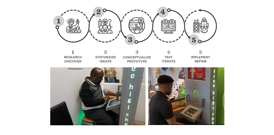
As the lead UX designer, I owned this project from beginning to end. I conducted discovery research, built prototypes, facilitated design reviews, and collaborated closely with legal, engineering, and product teams. I worked closely with legal and business stakeholders to write the plain-language content used in one of the test variants, simplifying legal concepts down to a 4th-grade reading level without compromising compliance. Throughout, I worked to balance user needs, business goals, and regulatory requirements.
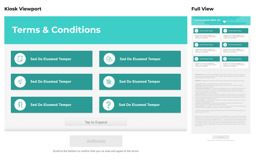
The abandonment pattern was clear in our analytics, and we confirmed the usability issues through observational feedback and user complaints. Users were told to scroll down to authorize, but this instruction only appeared at the bottom of the screen. The "tap to expand" element added further confusion, often hiding additional dense content that appeared unexpectedly.
Our hypothesis: if we made the language easier to understand and removed misleading UI elements, users would be more likely to authorize and continue.
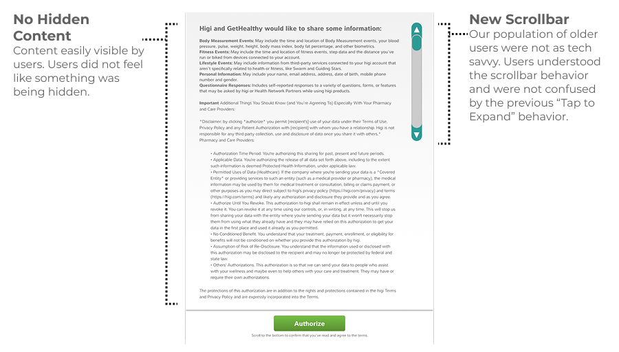
We tackled the most pressing friction first. We removed the "tap to expand" interaction and replaced it with a scroll bar that clarified the need to scroll. The screen layout was simplified so the user no longer encountered a confusing expanding section.
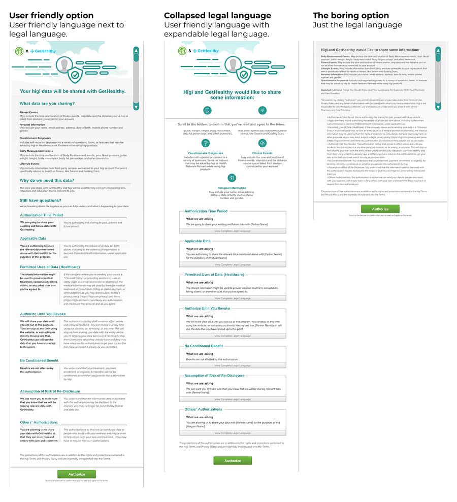
From there, we developed three versions of the screen in collaboration with our legal team:
We carefully structured each prototype to test user perception, trust, and comprehension.
We ran a moderated usability test where participants were randomly assigned one of the three versions. We collected reactions and followed up with open-ended questions to understand concerns and preferences.
"Will my insurance get a copy of all my data?"
Despite expressing a preference for the user-friendly approach in theory, participants were more likely to complete the flow without issue when presented with the plain legal version.
We implemented the "boring" version, which led to a significant increase in successful completions. Abandonment dropped from 60% to 40%, a 50% relative improvement in conversion.
While users didn't love the screen, they no longer felt stuck or confused. Most importantly, more people completed their check-ins and accessed their health measurements. This improved overall kiosk utilization and helped us meet key business goals.